If I’ve said it once, I’ve said it a million times…our primary bedroom is unnecessarily huge! I would much rather have more space in my laundry room that shares a wall with our bedroom than a large bedroom we don’t use a ton. But, it is what it is. I have finally decorated the awkward corner in a way that suits us. It’s probably supposed to be an office space? A sitting area? We aren’t really sure, but we have added a few things that at least make it feel “finished”. Here’s how to style a corner in a large primary bedroom.

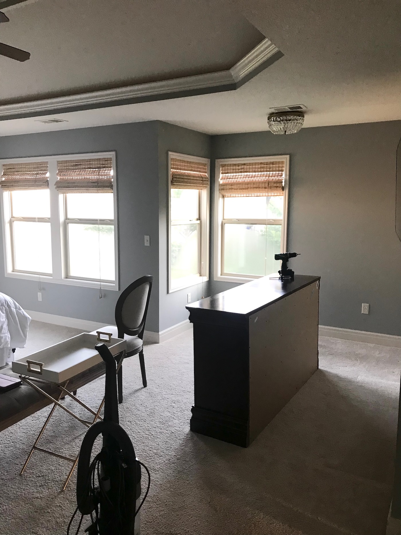
Before Photos
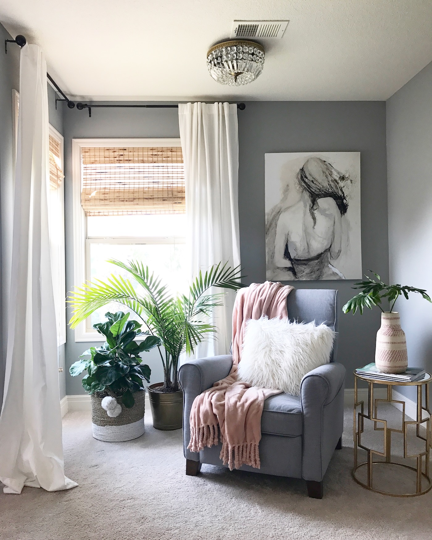
We have lived in this home since January 2012. A lot of changes have happened during that period of time, big and small. We view our home as a constant work in progress, nothing that is ever done. It’s not my way! Always changing, updated, scheming about the next thing. It is definitely a hobby and a joy of mine to wok on our home and create a space for my family that we all love. I want my teenagers to want to be home (at least some of the time)! A few photos from the earlier days.
Black Dresser
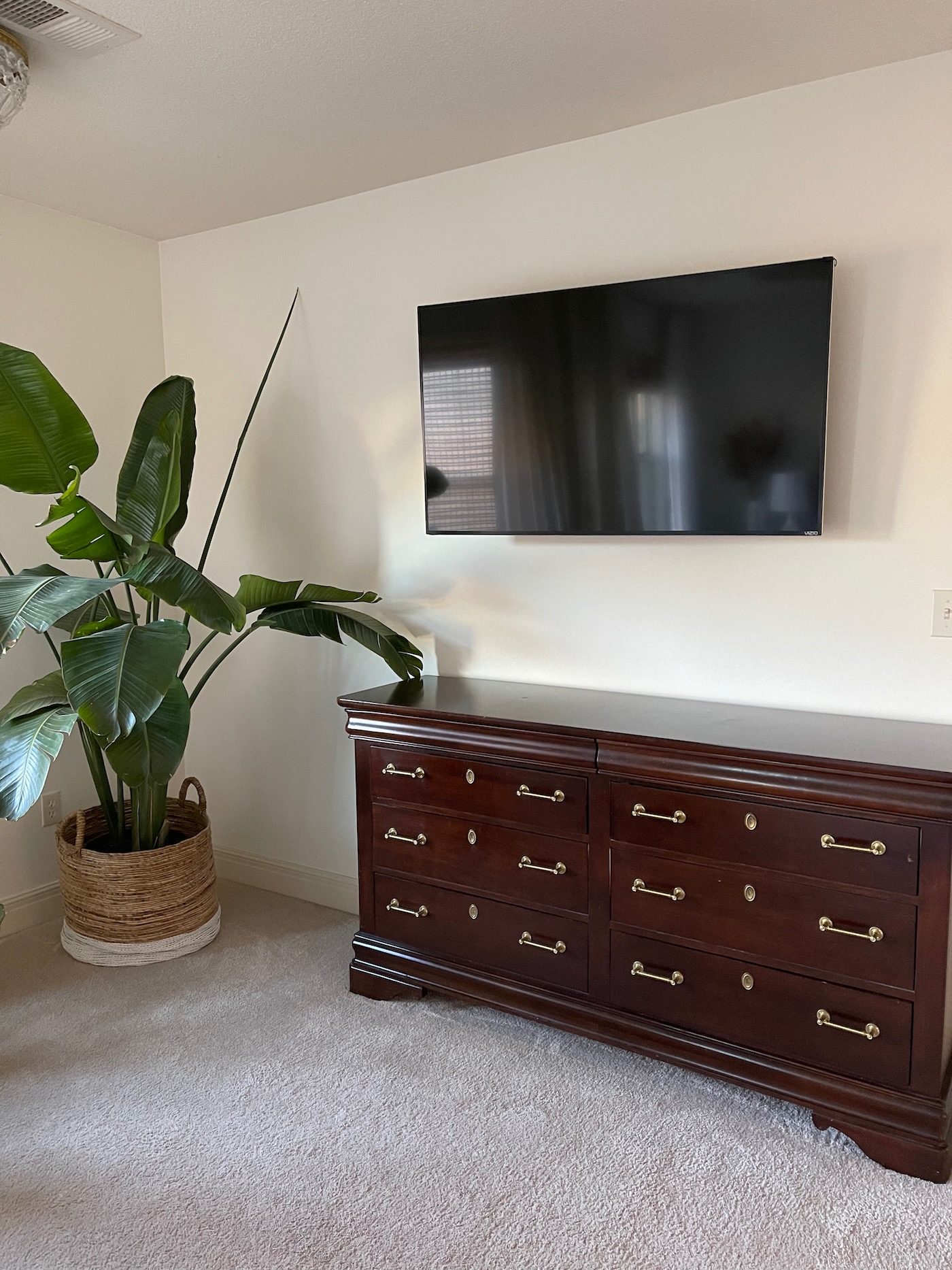
We had a cherry wood dresser set when we first got married. Remember those?! What were we thinking? Over the years, we sold the bed frame and the large armor, but kept the dresser (see photo above). It was functional and in really good shape and solid wood. I did update the knobs at some point. Finally, we decided to upgrade to a new dresser. We chose a black/brass one from West Elm. I absolutely love the look of it. It’s sleek and modern and we won’t tire of it. I will say the drawers aren’t super deep, so if you are looking for something really roomy, this is not the dresser for you. As in our case, we needed something aesthetically pleasing. We do store items in the dresser, but nothing we access every day. All of our daily stuff is in our closet (also unnecessarily huge)!
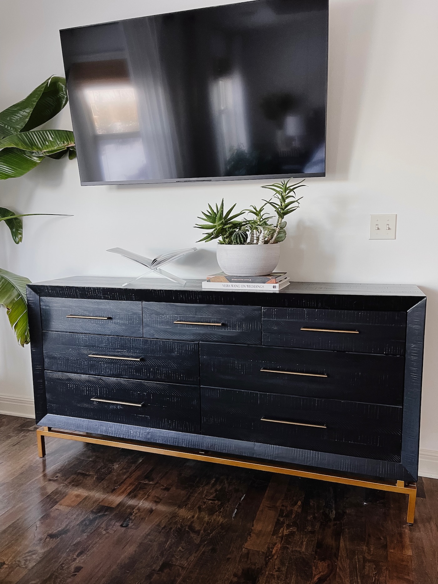
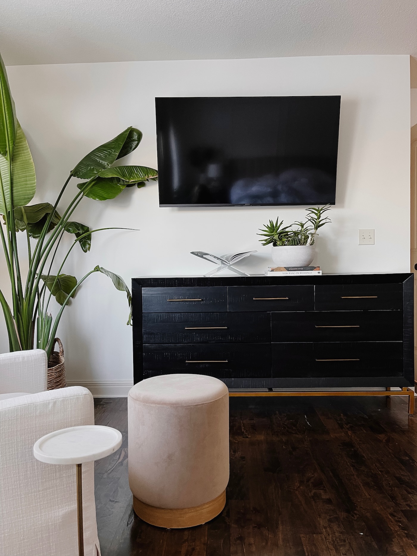
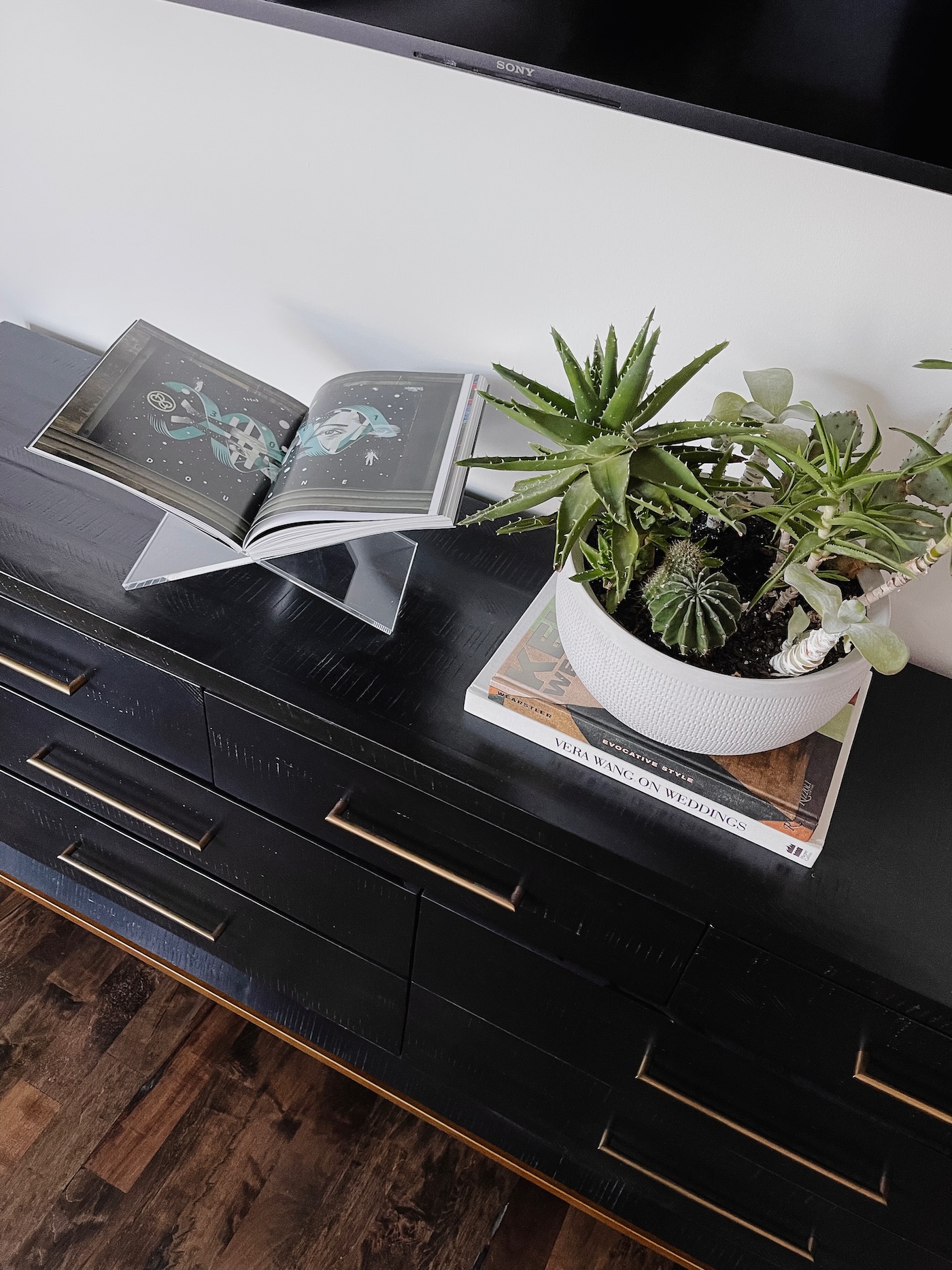
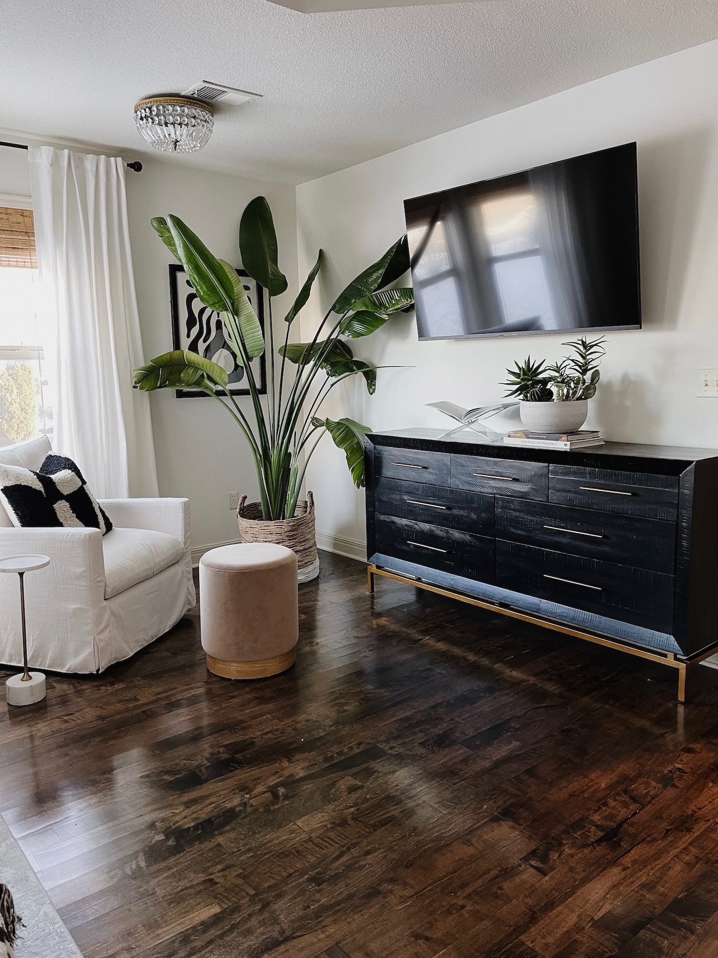
Because we use this TV nightly, I wanted to keep the top of the dresser super simple. This acrylic book holder houses a book we bought on a trip to Amsterdam. The Vera Wang wedding book is part of our wedding proposal, and the other book is a design book I love. Less stuff on surfaces means they are much easier to dust!
Hardwood Floors
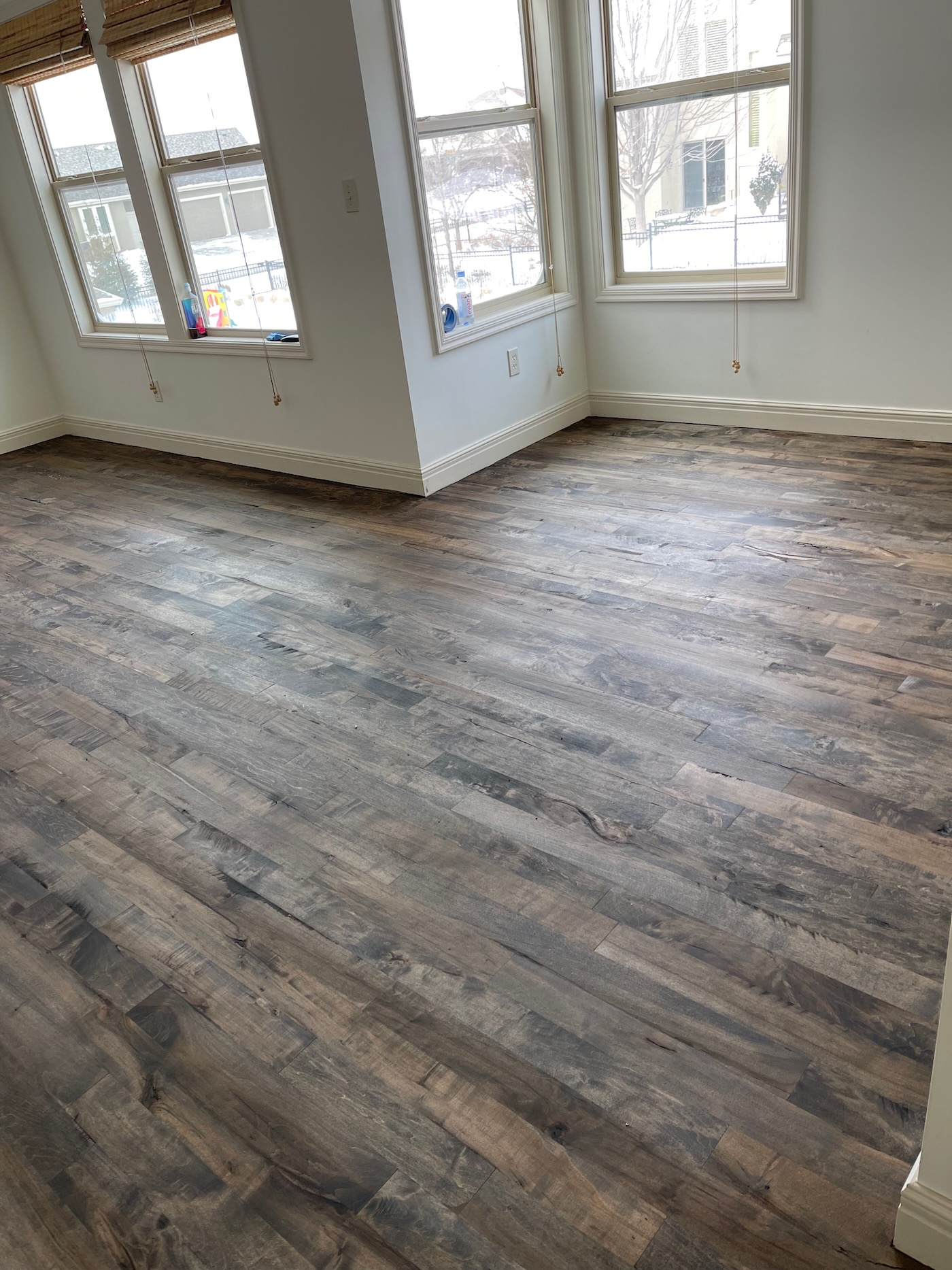
One of the major upgrades for this bedroom was having hardwood floors installed. We had been wanting to do this for years, and finally pulled the trigger in 2022. What a difference! They now match the rest of the floors throughout most of our home (the rest of the bedrooms and parts of the basement still have carpet).
Sitting Area
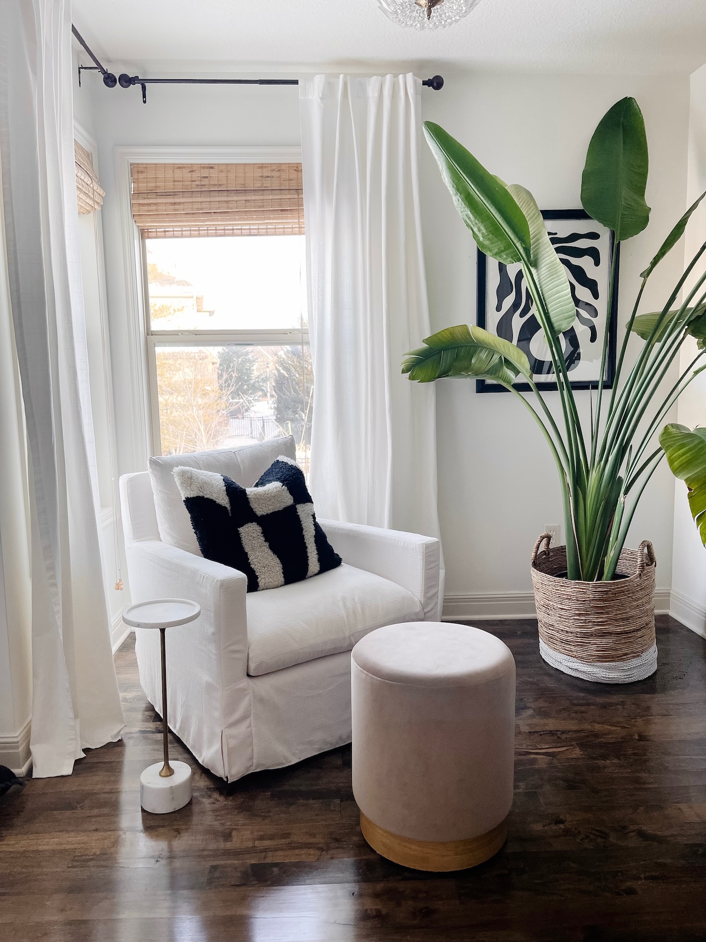
After moving the dresser underneath the TV, it allowed space for one small chair in the corner near the windows. We chose this upholstered swivel chair from World Market. It suits this area nicely as it’s small scale and fairly comfortable. For as little as someone sits here, the aesthetics work. We are a family that likes to put our feet up, so we like this option when someone does sit here! Adding this velvet ottoman adds function and texture to the space. I’ve linked one almost exactly like this one (ours is no longer sold).
I added this large graphic black and white pillow for a pop and something to draw your eye in. A small drink table fits perfectly next to the chair. This also adds texture and function and dimension to the space.
Plants!
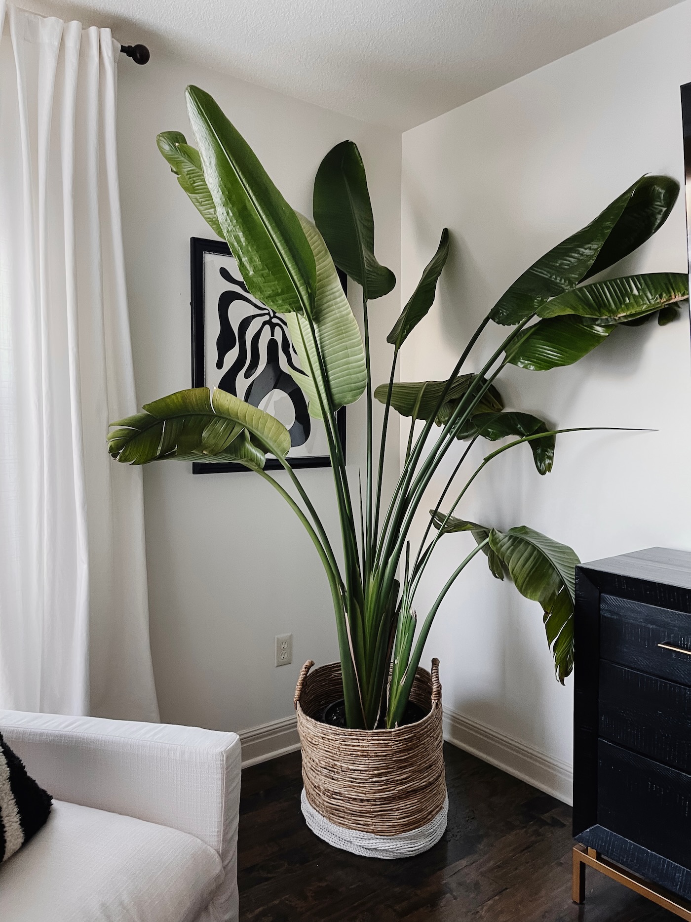
Of course, I have to have plants in every room! I read once, many years ago, that every room should have something alive. For me, this is easy, because I love house plants. This bird of paradise just keeps growing and filling out! I can say it’s very happy in this corner. I used to have other plants around it, but it’s gotten so big, she is the just the star of the show now. The large grass basket is from Homegoods. Be sure to put a catch tray between your plant and the basket so you don’t ruin your floors!
Other Info in the Space
- Curtains – These cream curtains are from IKEA (Ritva). We have four panels in the room in total.
- Bamboo Shades – These are from Lowes. We bought them to cut to size when we first moved in. I don’t remember the brand!
- Curtain Rods – These are from World Market from over 10 years ago.
- Black and white flower art is from Homegoods.
- Light fixture is vintage – one of my favorite finds!
- Paint Color – Benjamin Moore Swiss Coffee
If you have a large space you are trying to figure out what to do with, I hope how to style a corner in a large primary bedroom was helpful! This space feels so much like us with texture, dimension, black and white, plants, storage, form, and function. XO
